 BasicElement
 Label
Label
 CheckBox
 PauseButton
 InfoButton
BasicElements package includes the basic elements and the base classes that the library developer has to extend to create new basic elements.
The relationship between the interfaces, the base classes and the classes describing the drwables elements is shown in Figure 1. The class names are placed inside rectangles. The partial class names are placed inside rectangles with dashed line borders. An arrow going from a rectangle A, containing one class, to a rectangle B, indicates that the classes contained in rectangle B inherit from the class contained in rectangle A.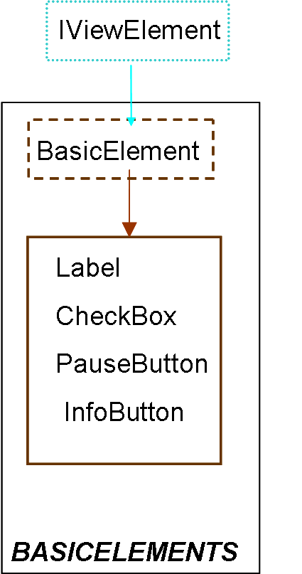
| Name | Description |
|---|---|
| BasicElement
| Base class of the classes describing basic elements |
| Label
| |
| CheckBox
| |
| PauseButton
| |
| InfoButton
|
 VirtualLabBuilder.src.ViewElements.BasicElements.BasicElement

BasicElement class has to be inhereted from the classes describing basic elements. This class inherits from the IViewElement class.
| Type | Name | Default | Description |
|---|---|---|---|
| positioninLayout | position | "CENTER" | Position inside its container |
| Type | Name | Description |
|---|---|---|
| ParentL | pLLeft | Connector of non drawable components |
| ChildL | cLLeft | Connector of non drawable components |
partial model BasicElement
  "Base class of the classes describing basic elements"
extends Interfaces.IViewElement;
 parameter TypesDef.positioninLayout position = "CENTER"
    "Position inside its container"; //when this container has the BorderLayout layout policy

//Global Variables****************
protected
  outer parameter String fileName "Name of the java file";
  outer parameter String fComponent;
  outer parameter String fInteractive;
  parameter String positionL = "BorderLayout." + position;
  Integer positionSelection = if pLLeft.borderLayout then 1 else 0;
end BasicElement;
 VirtualLabBuilder.src.ViewElements.BasicElements.Label
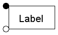
Creates a decorative label.
| Type | Name | Default | Description |
|---|---|---|---|
| positioninLayout | position | "CENTER" | Position inside its container |
| String | text | "text" | Text to be displayed |
| alignmentType | alignment | "0.00" | Alignment of the text |
| Color | background[4] | {255,255,255,255} | Background color |
| Color | foreground[4] | {0,0,0,255} | Foreground color |
| fontType | typeOfFont | "Times New Roman" | Type of font of the text |
| fontStyle | styleOfFont | "Plain" | Style of font of the text |
| Integer | sizeOfFont | 10 | Size of font |
| Type | Name | Description |
|---|---|---|
| ParentL | pLLeft | Connector of non drawable components |
| ChildL | cLLeft | Connector of non drawable components |
model Label
             extends BasicElement;
  import Modelica.Utilities.*;

parameter String text = "text" "Text to be displayed";
parameter TypesDef.alignmentType alignment = "0.00" "Alignment of the text";
parameter TypesDef.Color background = {255, 255, 255, 255} "Background color";
parameter TypesDef.Color foreground = {0, 0, 0, 255} "Foreground color";
parameter TypesDef.fontType typeOfFont = "Times New Roman"
    "Type of font of the text";
parameter TypesDef.fontStyle styleOfFont = "Plain" "Style of font of the text";
parameter Integer sizeOfFont( min = 5, max = 45) = 10 "Size of font";

initial algorithm
 num :=Functions.processingFile(fComponent);
  Functions.label(
    fileName,
    "node" + String(num),
    "node" + String(pLLeft.nodeReference),
    text,
    alignment,
    background,
    foreground,
    typeOfFont,
    styleOfFont,
    sizeOfFont,
    positionSelection,
    positionL);

end Label;
 VirtualLabBuilder.src.ViewElements.BasicElements.CheckBox
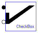
Creates a check-box. The checkbox allows to show and hide the virtual-lab windows by clicking on it.
| Type | Name | Default | Description |
|---|---|---|---|
| positioninLayout | position | "CENTER" | Position inside its container |
| booleanValue | initialValue | "false" | Initial value |
| String | label | "" | String displayed by the element |
| String | varName | "var" | String variable that can be linked to the corresponding variable of a dialog window in order to show and hide the window by clicking on the check-box |
| Type | Name | Description |
|---|---|---|
| ParentL | pLLeft | Connector of non drawable components |
| ChildL | cLLeft | Connector of non drawable components |
model CheckBox
     extends BasicElement;
  import Modelica.Utilities.*;
 parameter TypesDef.booleanValue initialValue= "false" "Initial value";
 parameter String label= "" "String displayed by the element";
 parameter String varName = "var"
    "String variable that can be linked to the corresponding variable of a dialog window in order to show and hide the window by clicking on the check-box";

initial algorithm
  num :=Functions.processingFile(fComponent);
 Functions.checkBox(fileName,"node"+String(num),"node"+String(pLLeft.nodeReference),initialValue,  label, varName, positionSelection, positionL);

end CheckBox;
 VirtualLabBuilder.src.ViewElements.BasicElements.PauseButton
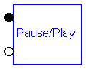
Creates button that allows the user to pause and resume the simulation by clicking on it.
| Type | Name | Default | Description |
|---|---|---|---|
| positioninLayout | position | "CENTER" | Position inside its container |
| booleanValue | buttonPause | "false" | Initial value |
| Type | Name | Description |
|---|---|---|
| ParentL | pLLeft | Connector of non drawable components |
| ChildL | cLLeft | Connector of non drawable components |
model PauseButton

                    extends BasicElement;

  import Modelica.Utilities.*;

parameter TypesDef.booleanValue buttonPause = "false" "Initial value";

initial algorithm
 num :=Functions.processingFile(fComponent);
 Functions.pauseButton(fileName, "node"+String(num), "node"+String(pLLeft.nodeReference), buttonPause, positionSelection, positionL);

equation

end PauseButton;
 VirtualLabBuilder.src.ViewElements.BasicElements.InfoButton
Creates a button that allows the user to show or hide a window displaying HTML pages. This feature allows including documentation in the virtual-lab. That is to say, it supports the implementation of the virtual-lab introduction.
| Type | Name | Default | Description |
|---|---|---|---|
| positioninLayout | position | "CENTER" | Position inside its container |
| booleanValue | selected | "false" | Whether the button is selected or not |
| String | label | "info" | Text displayed by the button |
| alignmentType | alignment | "0.00" | Text alignment |
| String | image | "" | Path of the image of the button |
| Color | bgcolor[4] | {255,255,255,255} | Background color |
| String | tooltip | "" | Tooltip |
| Color | lettercolor[4] | {0,0,0,255} | String color |
| fontType | typeFont | "Times New Roman" | Type of font |
| fontStyle | styleFont | "Plain" | Style of font |
| Integer | sizeFont | 20 | Size of font |
| String | path | "" | location of the html file |
| Integer | xPos | 400 | Position of the dialog window displayed by the button |
| Integer | yPos | 0 | Position of the dialog window displayed by the button |
| Integer | xWidth | 400 | Width of the dialog window displayed by the button |
| Integer | yWidth | 400 | Width of the dialog window displayed by the button |
| String | title | "Info window" | Title of the dialog window displayed by the button |
| Type | Name | Description |
|---|---|---|
| ParentL | pLLeft | Connector of non drawable components |
| ChildL | cLLeft | Connector of non drawable components |
model InfoButton
                    extends BasicElement;

  import Modelica.Utilities.*;
//When the user presses this button appears a window with text in html format.
  parameter TypesDef.booleanValue selected = "false"
    "Whether the button is selected or not";
  parameter String label = "info" "Text displayed by the button";
  parameter TypesDef.alignmentType alignment = "0.00" "Text alignment";
  parameter String image = "" "Path of the image of the button";
  parameter TypesDef.Color bgcolor = {255, 255, 255, 255} "Background color";
  parameter String tooltip = "" "Tooltip";  //Falta reescribir parametros y llamar a funcion infoButton
  parameter TypesDef.Color lettercolor =  {0,0,0,255} "String color";
  parameter TypesDef.fontType typeFont = "Times New Roman" "Type of font";
  parameter TypesDef.fontStyle styleFont = "Plain" "Style of font";
  parameter Integer sizeFont( min = 5, max = 45) = 20 "Size of font";
  parameter String path = "" "location of the html file";
  parameter Integer xPos = 400
    "Position of the dialog window displayed by the button";
  parameter Integer yPos = 0
    "Position of the dialog window displayed by the button";
  parameter Integer xWidth = 400
    "Width of the dialog window displayed by the button";
  parameter Integer yWidth = 400
    "Width of the dialog window displayed by the button";
  parameter String title = "Info window"
    "Title of the dialog window displayed by the button";
initial algorithm

  num :=Functions.processingFile(fComponent);
  Functions.infoButton(fileName, "node"+String(num), "node"+String(pLLeft.nodeReference), selected,
  label, alignment, image, bgcolor, tooltip, lettercolor, typeFont, styleFont, sizeFont, path, xPos, yPos,
  xWidth, yWidth, title, positionSelection, positionL);

equation

end InfoButton;