 ControlElement
 Slider
 NumberField
 RadioButton
 Button1Action
 Button2Actions
 SliderSet
InteractiveControls package includes the interactive elements and the base classes that the library developer has to extend to create new interactive elements.
The relationship between the interfaces, the base classes and the classes describing the interactive elements is shown in Figure 1. The class names are placed inside rectangles. The partial class names are placed inside rectangles with dashed line borders. An arrow going from a rectangle A, containing one class, to a rectangle B, indicates that the classes contained in rectangle B inherit from the class contained in rectangle A.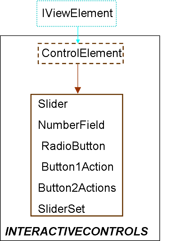
| Name | Description |
|---|---|
| ControlElement
| Base class of the classes describing interactive elements |
| Slider
| Creates a slider |
| NumberField
| Allows editing a numeric value |
| RadioButton
| Creates a radio-button |
| Button1Action
| Creates a 1 action button |
| Button2Actions
| Creates a 2 actions button |
| SliderSet
| Creates a set of sliders |
 VirtualLabBuilder.src.ViewElements.InteractiveControls.ControlElement

ControlElement class has to be inhereted from the classes describing interactive elements. This class inherits from the IViewElement class.
The ControlElement class includes the code required to:
| Type | Name | Default | Description |
|---|---|---|---|
| positioninLayout | position | "CENTER" | Position inside its container |
| Type | Name | Description |
|---|---|---|
| ParentL | pLLeft | Connector of non drawable components |
| ChildL | cLLeft | Connector of non drawable components |
partial model ControlElement
  "Base class of the classes describing interactive elements"
extends Interfaces.IViewElement;
 input Real var(stateSelect = if state then StateSelect.always else StateSelect.default);
 output Boolean event(start=false);
 parameter TypesDef.positioninLayout position = "CENTER"
    "Position inside its container"; //when this container has the BorderLayout layout policy

protected
 parameter Boolean state = true;
//Global Variables****************
protected
  outer parameter String fileName "Name of the java file";
  outer parameter String fComponent;
  outer parameter String fInteractive;
  parameter String positionL = "BorderLayout." + position;
  Integer positionSelection = if pLLeft.borderLayout then 1 else 0;
 outer parameter Integer sizeMax;
 outer Real CK[sizeMax];
 outer Real Inew[sizeMax];
//********************************
 Integer index "Number identifying the interactive element";

initial algorithm
 index :=Functions.processingFile(fInteractive);
equation
 when false then
     index  = pre(index);
 end when;
     event = CK[index]>0;
when noEvent(event) then
  reinit(var,Inew[index]);
end when;
end ControlElement;
 VirtualLabBuilder.src.ViewElements.InteractiveControls.Slider
This class inherits from the ControlElement class.
Creates a slider.
| Type | Name | Default | Description |
|---|---|---|---|
| positioninLayout | position | "CENTER" | Position inside its container |
| String | stringFormat | "0.00" | Format of the text displayed by the component |
| String | tickFormat | "0.00" | Format of the text displayed with the ticks |
| Integer | tickNumber | 9 | Number of ticks |
| Real | minimum | 0 | Minimum value of the variable linked to the component |
| Real | maximum | 1 | Maximum value of the variable linked to the component |
| Real | factor | 1 | Scale factor |
| booleanValue | enable | "true" | True if the component is enabled |
| Type | Name | Description |
|---|---|---|
| ParentL | pLLeft | Connector of non drawable components |
| ChildL | cLLeft | Connector of non drawable components |
model Slider "Creates a slider"

              extends ControlElement;
  import Modelica.Utilities.*;

 parameter String stringFormat = "0.00"
    "Format of the text displayed by the component";
 parameter String tickFormat = "0.00"
    "Format of the text displayed with the ticks";
 parameter Integer tickNumber = 9 "Number of ticks";
 parameter Real minimum = 0
    "Minimum value of the variable linked to the component";
 parameter Real maximum = 1
    "Maximum value of the variable linked to the component";
 parameter Real factor = 1 "Scale factor";
                    //Scale factor applied to the value of the variable linked to this component when the value is displayed by the component
 parameter TypesDef.booleanValue enable = "true"
    "True if the component is enabled";

initial algorithm

 num :=Functions.processingFile(fComponent);
 Functions.slider(fileName,"node"+String(num),"node"+String(pLLeft.nodeReference),var, stringFormat, tickFormat, tickNumber,
minimum, maximum, factor,enable, index, positionSelection, positionL);

equation

end Slider;
 VirtualLabBuilder.src.ViewElements.InteractiveControls.NumberField
This class inherits from the ControlElement class.
Creates an element that allows editing a numeric value.
| Type | Name | Default | Description |
|---|---|---|---|
| positioninLayout | position | "CENTER" | Position inside its container |
| String | stringFormat | "0.00" | Format of the displayed number |
| booleanValue | enable | "true" | 1: enabled, 0: disabled |
| Type | Name | Description |
|---|---|---|
| ParentL | pLLeft | Connector of non drawable components |
| ChildL | cLLeft | Connector of non drawable components |
model NumberField "Allows editing a numeric value"

              extends ControlElement;
  import Modelica.Utilities.*;
 parameter String stringFormat = "0.00" "Format of the displayed number";

 parameter TypesDef.booleanValue enable = "true" "1: enabled, 0: disabled";

initial algorithm

 num :=Functions.processingFile(fComponent);
 Functions.numberField(fileName,"node"+String(num),"node"+String(pLLeft.nodeReference), var, stringFormat,
enable, index, positionSelection, positionL);

equation

end NumberField;
 VirtualLabBuilder.src.ViewElements.InteractiveControls.RadioButton
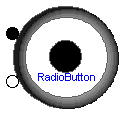
This class inherits from the ControlElement class.
Creates a radio-button.
The var variable of this element can have the value 0 or 1.
| Type | Name | Default | Description |
|---|---|---|---|
| positioninLayout | position | "CENTER" | Position inside its container |
| booleanValue | buttonValue | "true" | Initial value |
| String | text | "radioButton" | Text displayed by the element |
| String | buttonGroup | "buttonGroup" | The radio-button belongs to this group |
| Type | Name | Description |
|---|---|---|
| ParentL | pLLeft | Connector of non drawable components |
| ChildL | cLLeft | Connector of non drawable components |
model RadioButton "Creates a radio-button"

                 extends ControlElement;
  import Modelica.Utilities.*;

   parameter TypesDef.booleanValue buttonValue = "true" "Initial value";
   parameter String text = "radioButton" "Text displayed by the element";
   parameter String buttonGroup = "buttonGroup"
    "The radio-button belongs to this group";

initial algorithm

 num :=Functions.processingFile(fComponent);
 Functions.radioButton(fileName, "node"+String(num), "node"+String(pLLeft.nodeReference), buttonValue, index, text, buttonGroup, positionSelection, positionL);

equation

end RadioButton;
 VirtualLabBuilder.src.ViewElements.InteractiveControls.Button1Action
This class inherits from the ControlElement class.
Creates a button intended to be used to perform a model action.
The value of the variable linked to this button is one only when the user clicks on the button.
The virtual-lab developer can associate one action to this button by including the action's code in a when section of the model.
This when section must be implemented to be triggered when the value of the variable linked to this button is one.
| Type | Name | Default | Description |
|---|---|---|---|
| positioninLayout | position | "CENTER" | Position inside its container |
| booleanValue | selected | "false" | Whether the button is selected or not |
| String | label | "info" | Text displayed by the button |
| alignmentType | alignment | "0.00" | Text alignment |
| String | image | "" | Path of the image of the button |
| Color | bgcolor[4] | {192,192,192,255} | Background color |
| String | tooltip | "" | Tooltip |
| Color | lettercolor[4] | {0,0,0,255} | String color |
| fontType | typeFont | "Times New Roman" | Type of font |
| fontStyle | styleFont | "Plain" | Style of font |
| Integer | sizeFont | 20 | Size of font |
| Type | Name | Description |
|---|---|---|
| ParentL | pLLeft | Connector of non drawable components |
| ChildL | cLLeft | Connector of non drawable components |
model Button1Action "Creates a 1 action button"

                    extends ControlElement;
  import Modelica.Utilities.*;

// When the user press the buttom, the variable linked to this button is 1.
//Otherwise the variable value is  zero.
  parameter TypesDef.booleanValue selected = "false"
    "Whether the button is selected or not";
  parameter String label = "info" "Text displayed by the button";
  parameter TypesDef.alignmentType alignment = "0.00" "Text alignment";
  parameter String image = "" "Path of the image of the button";
  parameter TypesDef.Color bgcolor = {192, 192, 192, 255} "Background color";
  parameter String tooltip = "" "Tooltip";  //Falta reescribir parametros y llamar a funcion infoButton
  parameter TypesDef.Color lettercolor =  {0,0,0,255} "String color";
  parameter TypesDef.fontType typeFont = "Times New Roman" "Type of font";
  parameter TypesDef.fontStyle styleFont = "Plain" "Style of font";
  parameter Integer sizeFont( min = 5, max = 45) = 20 "Size of font";

protected
 parameter Integer changeState = 0;
initial algorithm

 num :=Functions.processingFile(fComponent);
 Functions.button1Action(fileName, "node"+String(num), "node"+String(pLLeft.nodeReference),
 selected, label, alignment, image, bgcolor, tooltip, lettercolor, typeFont, styleFont, sizeFont,
  index, positionSelection, positionL);

equation

when CK[index]<=0 then
  reinit(var,0);
end when;

end Button1Action;
 VirtualLabBuilder.src.ViewElements.InteractiveControls.Button2Actions
This class inherits from the ControlElement class.
Creates a button intended to be used to perform two different model actions.
The value of the variable linked to this button changes from one to zero or from zero to one
when the user clicks on the button.
The virtual-lab developer can associate two different actions to this button.
He can implement the model so that one action
is triggered when the value of the button variable changes from zero to one
and the other one when the value of the button variable changes from one to zero.
| Type | Name | Default | Description |
|---|---|---|---|
| positioninLayout | position | "CENTER" | Position inside its container |
| booleanValue | selected | "false" | Whether the button is selected or not |
| String | label | "info" | Text displayed by the button |
| alignmentType | alignment | "0.00" | Text alignment |
| String | image | "" | Path of the image of the button |
| Color | bgcolor[4] | {192,192,192,255} | Background color |
| String | tooltip | "" | Tooltip |
| Color | lettercolor[4] | {0,0,0,255} | String color |
| fontType | typeFont | "Times New Roman" | Type of font |
| fontStyle | styleFont | "Plain" | Style of font |
| Integer | sizeFont | 20 | Size of font |
| Type | Name | Description |
|---|---|---|
| ParentL | pLLeft | Connector of non drawable components |
| ChildL | cLLeft | Connector of non drawable components |
model Button2Actions "Creates a 2 actions button"

              extends ControlElement;
  import Modelica.Utilities.*;
// The variable linked to this button can get the value 1 or 0.
// Each time the user press the button the value of the variable linked to this button change from value 1 to 0 or vice versa alternatively.

  parameter TypesDef.booleanValue selected = "false"
    "Whether the button is selected or not";
  parameter String label = "info" "Text displayed by the button";
  parameter TypesDef.alignmentType alignment = "0.00" "Text alignment";
  parameter String image = "" "Path of the image of the button";
  parameter TypesDef.Color bgcolor = {192, 192, 192, 255} "Background color";
  parameter String tooltip = "" "Tooltip";
  parameter TypesDef.Color lettercolor =  {0,0,0,255} "String color";
  parameter TypesDef.fontType typeFont = "Times New Roman" "Type of font";
  parameter TypesDef.fontStyle styleFont = "Plain" "Style of font";
  parameter Integer sizeFont( min = 5, max = 45) = 20 "Size of font";

protected
 parameter Integer changeState = 0;
initial algorithm
 num :=Functions.processingFile(fComponent);
 Functions.button2Actions(fileName, "node"+String(num), "node"+String(pLLeft.nodeReference),
 selected, label, alignment, image, bgcolor, tooltip, lettercolor, typeFont, styleFont, sizeFont,
  index, positionSelection, positionL);

end Button2Actions;
 VirtualLabBuilder.src.ViewElements.InteractiveControls.SliderSet
Creates a set of sliders.
| Type | Name | Default | Description |
|---|---|---|---|
| Integer | N | 2 | Number of sliders |
| String | stringFormat[N] | Format of the text displayed by the component | |
| String | tickFormat | "0.00" | Format of the text displayed with the ticks |
| Integer | tickNumber[N] | 9*ones(N) | Number of ticks |
| Real | minimum[N] | zeros(N) | Minimum value of the variable linked to the component |
| Real | maximum[N] | ones(N) | Maximum value of the variable linked to the component |
| Real | factor[N] | ones(N) | Scale factor |
| booleanValue | enable | "true" | True if the component is enabled |
| Type | Name | Description |
|---|---|---|
| ParentL | parentL | Connector of drawables |
| ChildL | childL | Connector of drawables |
model SliderSet "Creates a set of sliders"
  import VirtualLabBuilder;
 parameter Integer N = 2 "Number of sliders";
 input Real var[N];

 parameter String stringFormat[N]
    "Format of the text displayed by the component";
 parameter String tickFormat = "0.00"
    "Format of the text displayed with the ticks";
 parameter Integer tickNumber[N] = 9*ones(N) "Number of ticks";
 parameter Real minimum[N] = zeros(N)
    "Minimum value of the variable linked to the component";
 parameter Real maximum[N] = ones(N)
    "Maximum value of the variable linked to the component";
 parameter Real factor[N] = ones(N) "Scale factor";
                    //Scale factor applied to the value of the variable linked to this component when the value is displayed by the component
 parameter TypesDef.booleanValue enable = "true"
    "True if the component is enabled";

 Slider sliders[N](stringFormat = stringFormat, tickFormat = tickFormat,
  tickNumber = tickNumber, minimum = minimum, maximum = maximum, factor = factor, enable = enable);
  VirtualLabBuilder.src.Interfaces.ParentL parentL "Connector of drawables";
  VirtualLabBuilder.src.Interfaces.ChildL childL "Connector of drawables";
equation
    connect(sliders[1].pLLeft,parentL);
    connect(sliders[N].cLLeft,childL);
 for i in 1:N-1 loop
    connect(sliders[i].cLLeft,sliders[i+1].pLLeft);
 end for;
 for i in 1:N loop
    sliders[i].var = var[i];
 end for;

end SliderSet;